In this
post, I am going to show you how I created my DVD Case. The final look is
the image above ready to be publish and printed. The next steps is how I
designed, create and build the case into completion.
Creating the Template and Layers/Groups
Firstly, I created a new document on Photoshop and adjusted my bearings like the width, height, resolution and colour modes etc. Secondly, I constructed my DVD case template (as seen below) using the measurement criteria on the assignment brief. I used the tools like the guides, rulers, grid-lines and move tools.
After creating my template I created a layers and two groups which I will be working on. I named the groups Front and Spine, Back and the layer Background as seen below. I also created sub-layers and folders in those groups as I was creating the case.
Moreover, I created a layer mask in both Front & Spine and Back groups(as seen above) so I can organise the sub-layers and folders in the groups. At this stage I used the hide all option under the layer mask option and whilst the layer mask was selected I used the rectangular tool and selected the front and spine area and clicked delete, this made the front and spine only visible and lock the back layer and vise versa. The advantage of this is it hides the other groups and make them separate entities it also makes you work on that layer to avoid any unwanted objects snapping in the other layer. This made my work smooth and fast.
Lastly, I changed the Background layer colour to Black preferably. I did this by holding Ctrl-A on my keyboard to select the whole template and hold Alt-Delete key to fill the selected area with the foreground colour which was Black.
Creating The Front and Spine
Step 1: Firstly, I brought some elements into the front cover. I open and went to images to select my main character for the movie and dragged it into the front cover. After pasting, I resized it using the Transform tool and held the shift key so I wont lose the resolution and proportion of the image . I placed it into a preferred position as shown below. Secondly, I created a layer mask for my image and selected reveal all under the layer mask option to see what I was masking, the reason why I created a layer mask is because I wanted to gradually fade out the image effectively and apply effects to it. Thirdly, I used the the Gradient tool to fade out the outline of the image, the gradient I used is the Black&White (Foreground to Background). With the gradient mode set to normal, I drew a straight line moving inwards the image to fade out the parts I want.
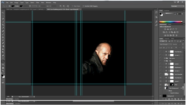
Up next, I imported my second image I wanted and that's the sub-character of the movie as shown below, I did the same procedure like the first image (Layer Mask -> Reveal All -> Gradient Tool etc.)
Step 2: Adjustment Layers and Effects
After importing the both images I created an Adjustment Layer (as shown above) and selected the Hue/Saturation option, I then used the different levels to adjust the hue, saturation and brightness of my image to my preferable tone (as shown below). I then added a blending mode to interact with the adjustments of my images so it can look more original, I liked and choose the hard light option in that instance.
Next up I needed something to grunge the cover and make more lively, I decided to create a new layer and import another image which was a city view artwork and I over-layed it with my two main images. After transforming it to the front cover size I then applied a blending mode to and dragged it underneath the two layered images so it can lay under them. (Shown Below)
Step 3: Creating the Title
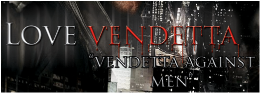
After creating a new layer and named it as Title and selected the Text tool to type in my movie title "Love Vendetta". In creating the title I opened the Character pallet to guide me select my type of font, font size, colour and effects.
In the character pallet I choose my font as Trajan Pro, colour as White and set my preferred font size and positioned it were I wanted it.
Overall I wanted to made a glow effect to the whole title, I choose the Outer Glow style in the Layer Styles Menu (as shown in the screenshots below).
I set its blending mode to Normal, the opacity to 100, the spread to 2 and the size to 55.
That's how it looks (Above) but I wanted to add some more modifications to it. I then right clicked on the title layer and choose the Convert to Smart Object option. I needed to do some tweaks with the title that's why I went for this option so any changes I make will be applied to the object. Next up, I applied a smart filter to my text under the filter menu, I went for the Blur effect and specifically Motion Blur.
I set the angle to 90 degrees and the distance to about 210 pixels.
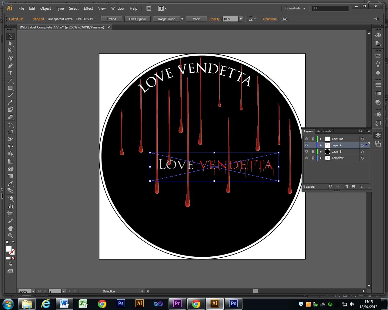
As you can see the screenshot above, that's the result of the Blur effect and additionally I sharpen the text edges found in the filter menu. These two effects complimented the title effectively. I adjusted the opacity of the text and added a drop shadow effect too. Next up, I wanted my title to be unique and link with what it really means i.e. Vendetta is a word I can use to make a bloody effect because the meaning of it links with the effect chosen respectively. With this concept, I edited the word "Vendetta" and started with a blood colour, I choose 9f0404 on my colour pallet which was a perfect bloody colour. Secondly, I selected a sizeable brush from my brush pallet and drew dripping lines off each letter, I drew multiple lines off each letter to make the dripping look more original.
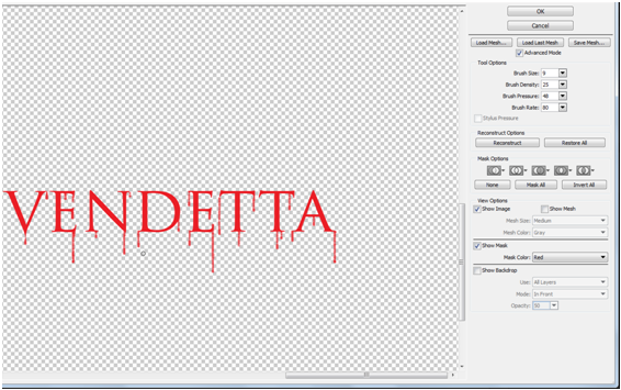
The above screenshot is the result after editing the text using a bloody colour and drawing dripping line with the brush tool. After this, I selected the liquefy option under the filter menu and that's the screenshot page above. I then adjusted my tool options of the right upper corner of the page and adjust the Brush Size to 40, Brush Density to 25, Brush Rate to 28. Up next, I selected the Pucker tool and hold shift on my keyboard and then go over every line with the pucker tool, what this does it shrinks the line and make a drippy look and the tip of the line. Lastly, I selected the Bloat tool and clicked-hold the drip end, what this does is it makes the drip thicker and make it look more original. (As seen Below).

After using various tools and effects, my text was looking good but I wanted to tweak it more by adding a blending mode to it. I added few effects to it like a Drop Shadow effect, Bevel&Emboss and Inner Shadow. I tuned the opacity level and set the blending mode option to Hard Light. (As Shown Below).
After applying a blending mode my text was looking Perfect and its look linked with its meaning. The below screenshot image is the final look of the "Vendetta" text.
As you can see, the title is looking more professional after all the editing I put in to it. Lastly, I added a slogan to the movie and I placed it underneath the title. Quote "Vendetta Against Men" to define movie. (Seen Below).
 |
| Title and Slogan |
Step 4: Creating the Cast Names
At the top of my front cover I wanted to add some cast member names like the actors and actresses in the movie just like the normal DVD cover looks like. To start, I created 5 layers and selected the Text tool. On each layer, I created text and an actor and on the next one I did the same. I did this on all 5 layers, lastly I applied some effects to it like Bevel&Emboss, Stroke, Drop Shadow and Inner Glow so they could look better than its original look. (See Screenshot Below).
The Spine
After successfully creating and editing the title I needed the same title on the spine, it was quite easy. I duplicate the title layer and placed it on the spine of the cover, whilst placing it I used the Transform tool to select the text and rotated it to fit the spine. (See Screenshot Below).
Creating the Back Cover
To start with the Back cover I created a tagline of text on the top part of the back cover named "Love, Liberty and the Pursuit of Vendetta..." that links with the movie title and movie it self. Basically, its a slogan for the movie. (See Screenshot Below)
Step 1: Still Images
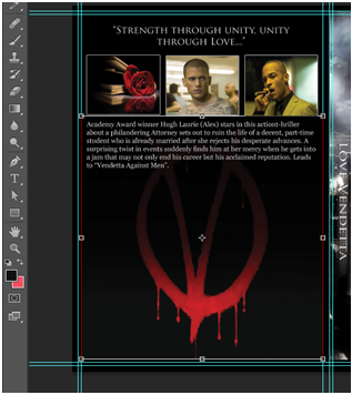
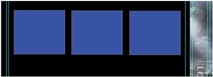
Next up I wanted to add some still images on the back cover, to do that I started by selecting the Rectangle tool from the tools pallet. I then created 3 rectangular objects beneath the tagline to import the images on to the objects, the rectangular object fitted the position with equal distance apart and created a clipping mask on each of them. I then named my layers picture 1, picture 2 and 3 in the layers pallet. These are vector shapes so next up I imported my images into these shapes, when I imported the images they where big in size so I had to crop it; before resizing it I wanted to clip them with the shapes so moved the first image layer on top of the picture 1 layer and hold the Alt key on my keyboard. This indicates an icon to paste the object within the mask, when I clicked whilst pressing the Alt key the image is pasted within the shape and its locked within the shape. This allows the image to be edited within the shape and where you move it, it stays inside the rectangle shape and this saves you time. I then resized the image by using the Transform tool (Ctrl-T) and moving the image within the shape and resizing it till it fits in the shape perfectly, I did this whole process in the other two images namely (picture 2 and 3) inside the other two rectangles. (See Screenshot Below)
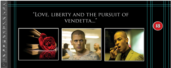
As you can see the screenshots above as explained. Lastly, I added a Stroke effect to each rectangle as seen above. I created the stroke colour as White, 5 pixels, positioned outside, Blending mode to Normal and the Opacity to 100%. These 3 still images are all dragged in a group named Still Images in the layers pallet after editing.
Step 2: Movie Description/Text
After creating my still images I then selected the Text tool to create my movie description underneath my still images, this process was quick as I have typed my description on Microsoft Word already. After pasting my text into the text box, I changed the font size to 10, colour to White and the leading to 12. (See Screenshot Below).
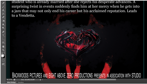
After adding the movie description text, I added an Image onto the back cover background. The image was a bloody letter V image to icon the name vendetta. (See Screenshot Below).
I then created a new layer and imported the image and added a blending mode to it so it can match the original case background which is Black. (See Screenshot Below).
After added the background image I added a Text below the back cover and this was the Cast and Credits of the movie. It was quit easy, just like I did on the movie description. I created a layer and selected the Text tool , this process was quick as I have typed my casting crew names and other details on Microsoft Word already. After I pasted my text into the text box, I changed the font as Arial and the size to 12, colour to White and the leading to 12, narrowed the text to 40 and adjusted the paragraph settings. I reduced the size of some text like with,and,presents etc to size 9 so it can have the DVD script-like look.(See Screenshot Below).
Step 3: Creating The Montage
To start off with, I created a layer group and named it Montage. A blank layer was created next which was inside the montage layer group, next up was to edit the area of the montage and I did this by selecting the Brush tool and selecting the "Chalk 60 Pixels" from the brush pallet. I checked the Shape Dynamics and adjusted the size jitter, I checked the Scattering and adjusted the scatter, count and count jitter. By doing this I was seeing the preview of the effect on the bottom of the page and I was satisfied with the effect. (See Screenshot Below).
Next up I started painting the area of the montage as I know I will create a clipping mask after painting to tweak it a bit. (See Screenshot Below)
After the painting is done I imported some images I wanted to paste on the montage, I imported a Heart image and resized it with the Transform tool and positioned the wanted part of the image over the image. The heart image was on its own layer and the montage painting too, so with these two layers I clipped them by holding the ALT key on the keyboard and clicked in-between the two just what I have done on the still images and the picture was pasted within the painted area of the montage. (See Screenshot Below).

Next up I imported two images I've already edited on Photoshop already, after resizing both images I placed one image on the end of the montage area and the other on the opposite end. I positioned both images with the heart in-between them and symbolising the love as the movie entails. I then added a clipping mask and then created a Gradient effect on both imaged using the Gradient tool, before starting the gradient process I add a blending mode of Darken to both images so I can apply a gradient from left to right of the image so they can blend in with the montage. (See Screenshot Below).
Lastly, I added 2 adjustment layers of Colour Balance and Hue&Saturation and clipped them with the other layers and objects. This spice up the montage a bit and I was satisfied with the look.
Final Look
As you can see the above screenshot shows the final look of the DVD Case. I added a DVD Icon, Ratings, Age Restrictions Icons, Sponsor and Region Information on both the front, spine and back cover.